Flow A · Screens 01–03
Onboarding
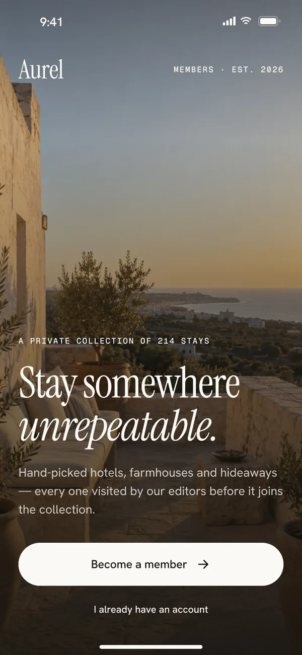
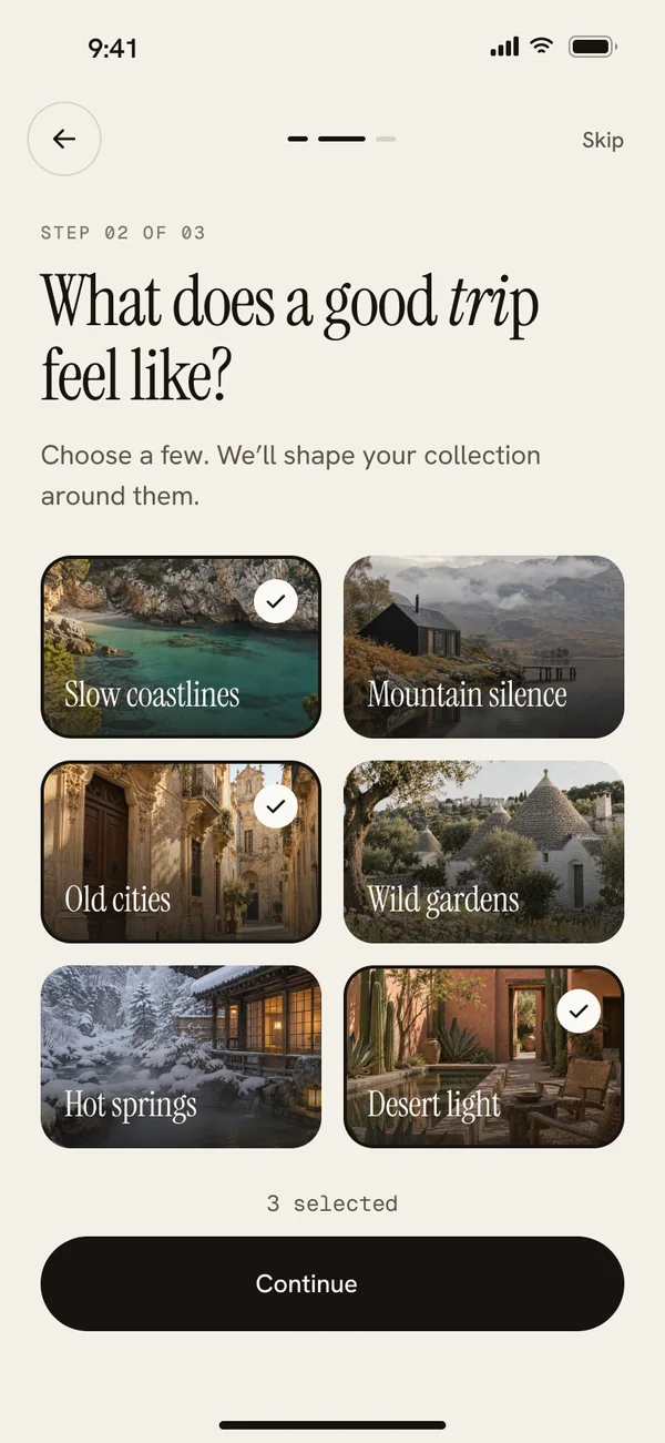
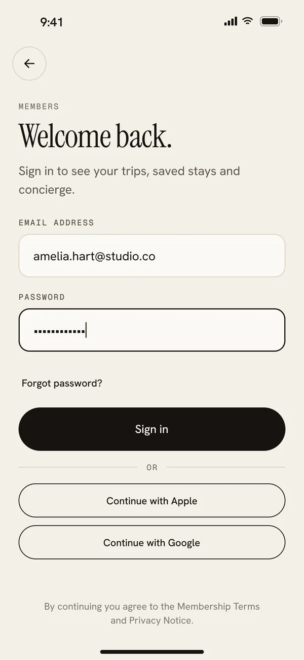
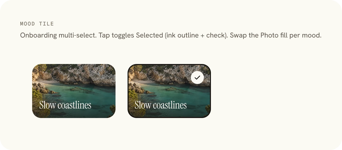
A welcome that sells the promise, three travel moods to shape the collection, and a calm sign-in. Nothing asks for more than it needs.
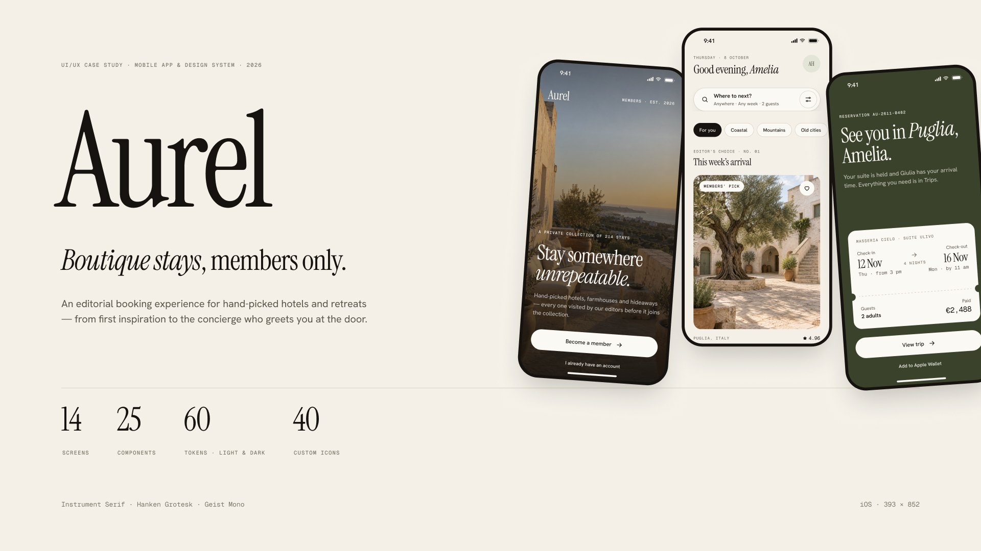
UI/UX case study · Mobile app & design system · 2026
Aurel is a members-only app for boutique stays: an editorial booking experience for hand-picked hotels and retreats, from first inspiration to the concierge who greets you at the door.
The product film, 57 seconds, animated in Figma. Sound on. The 9 : 16 cut is made for Reels and Stories.
01 · The idea
Booking apps are built for volume: thousands of listings, endless filters, prices shouting for attention. Aurel goes the other way. It is a private collection of 214 stays, and every one has been visited by an editor before it joins.
The app reads like a travel magazine. Editorial collections, honest photography and a map that shows only what matters lead into a booking that takes three taps, and a concierge who knows you are coming.
02 · Three flows
The 14 screens are organised as three flows, each one wired as its own path in the prototype, plus a fourth for dark mode.
Flow A · Screens 01–03
A welcome that sells the promise, three travel moods to shape the collection, and a calm sign-in. Nothing asks for more than it needs.
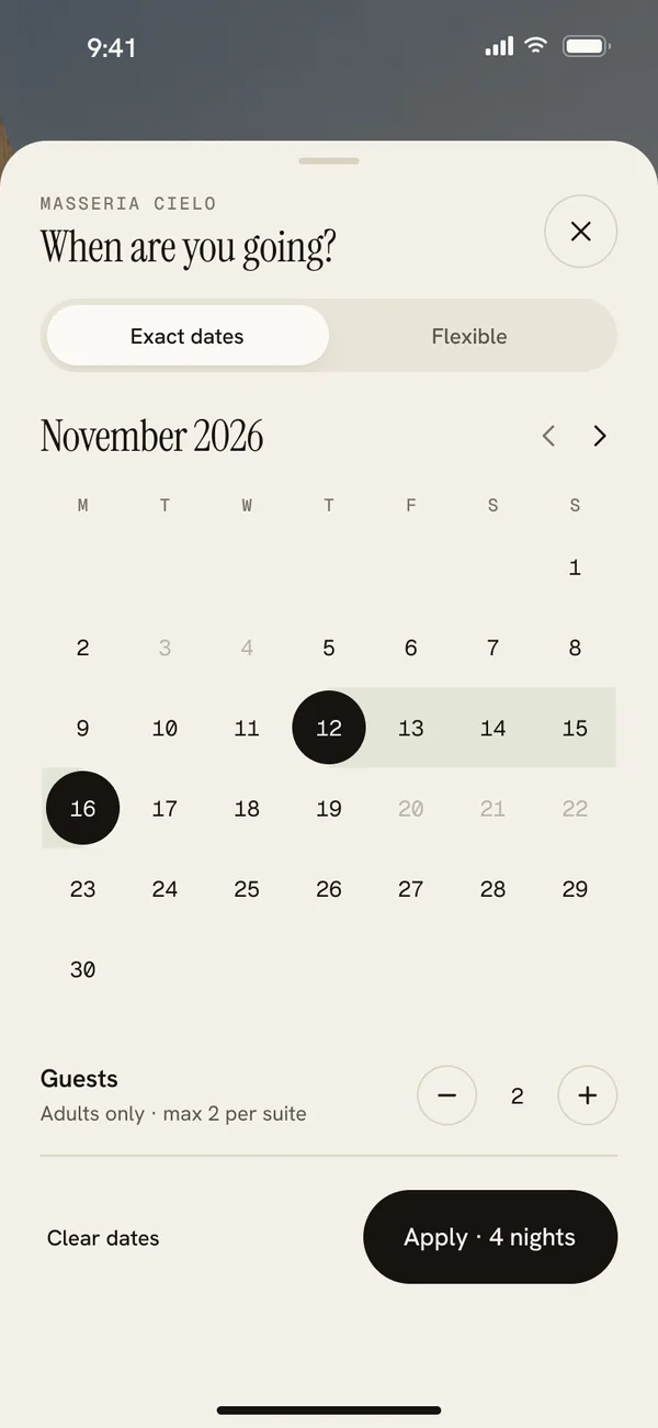
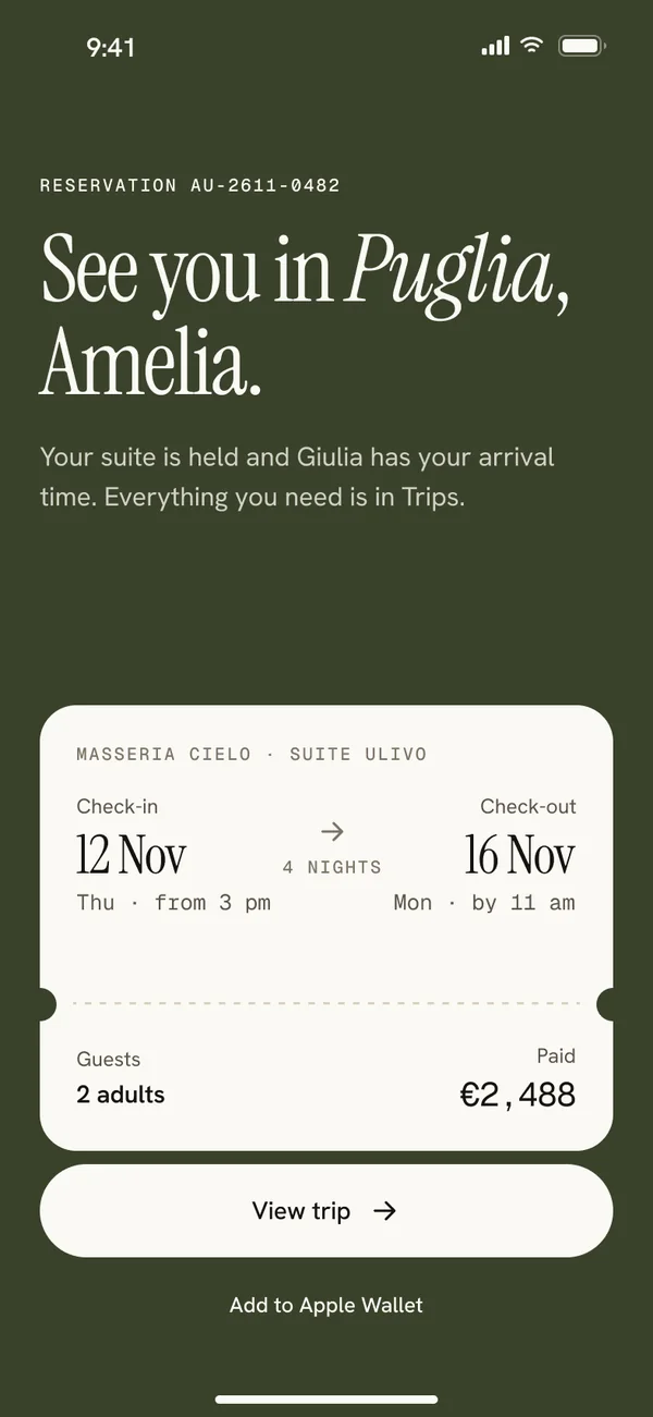
Flow B · Screens 04–09
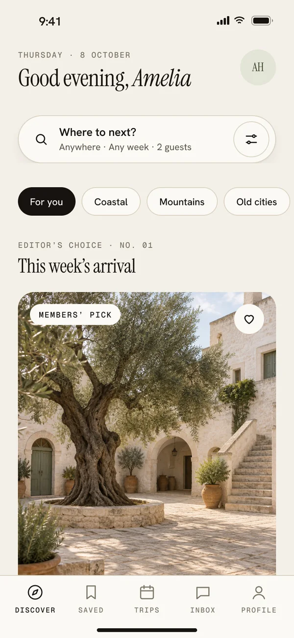
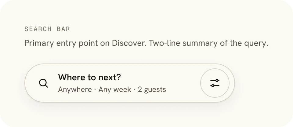
Discover by mood, search on a quiet map, read the stay like an article, then book in three taps. The price is broken down before you pay, with the member rate applied.
Flow C · Screens 10–13
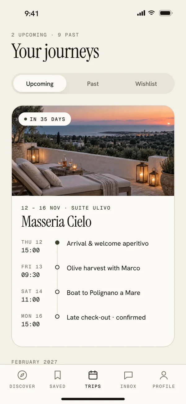
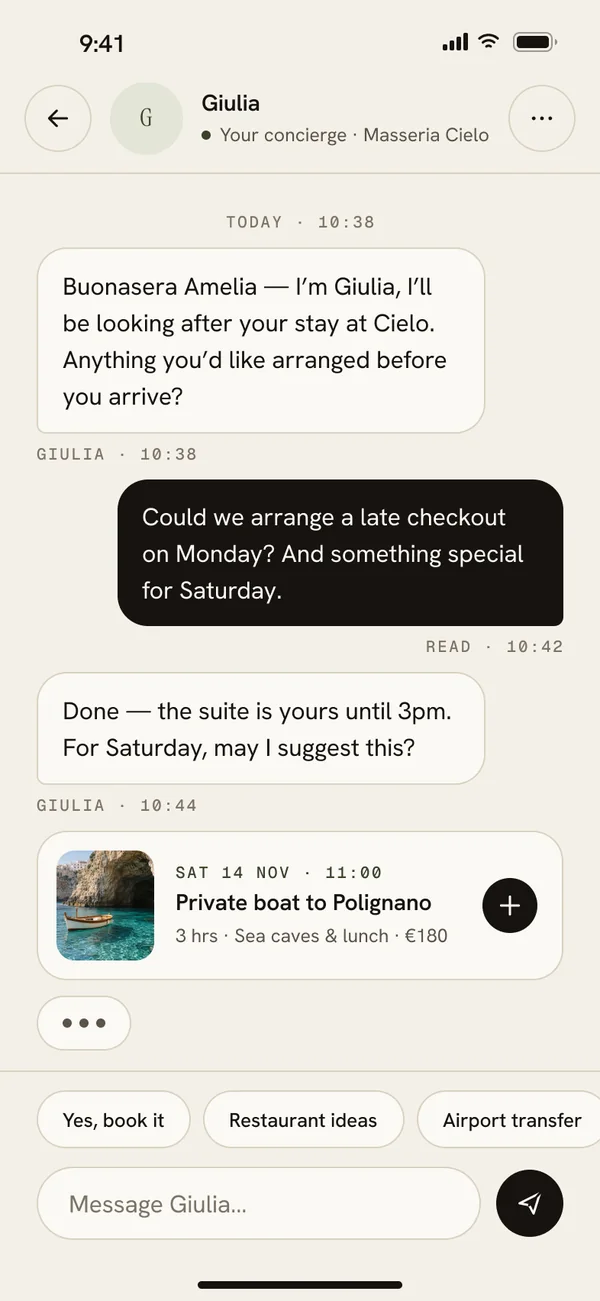
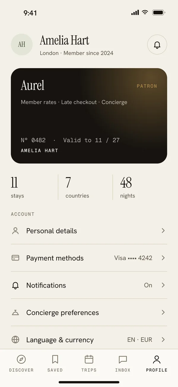
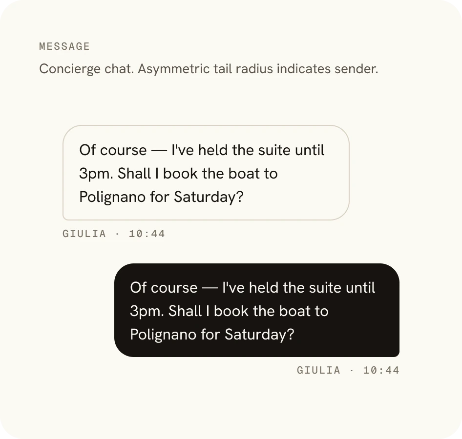
Trips as a day-by-day timeline, a concierge chat with Giulia from Masseria Cielo, saved collections, and a membership card that feels worth carrying.
03 · The design system
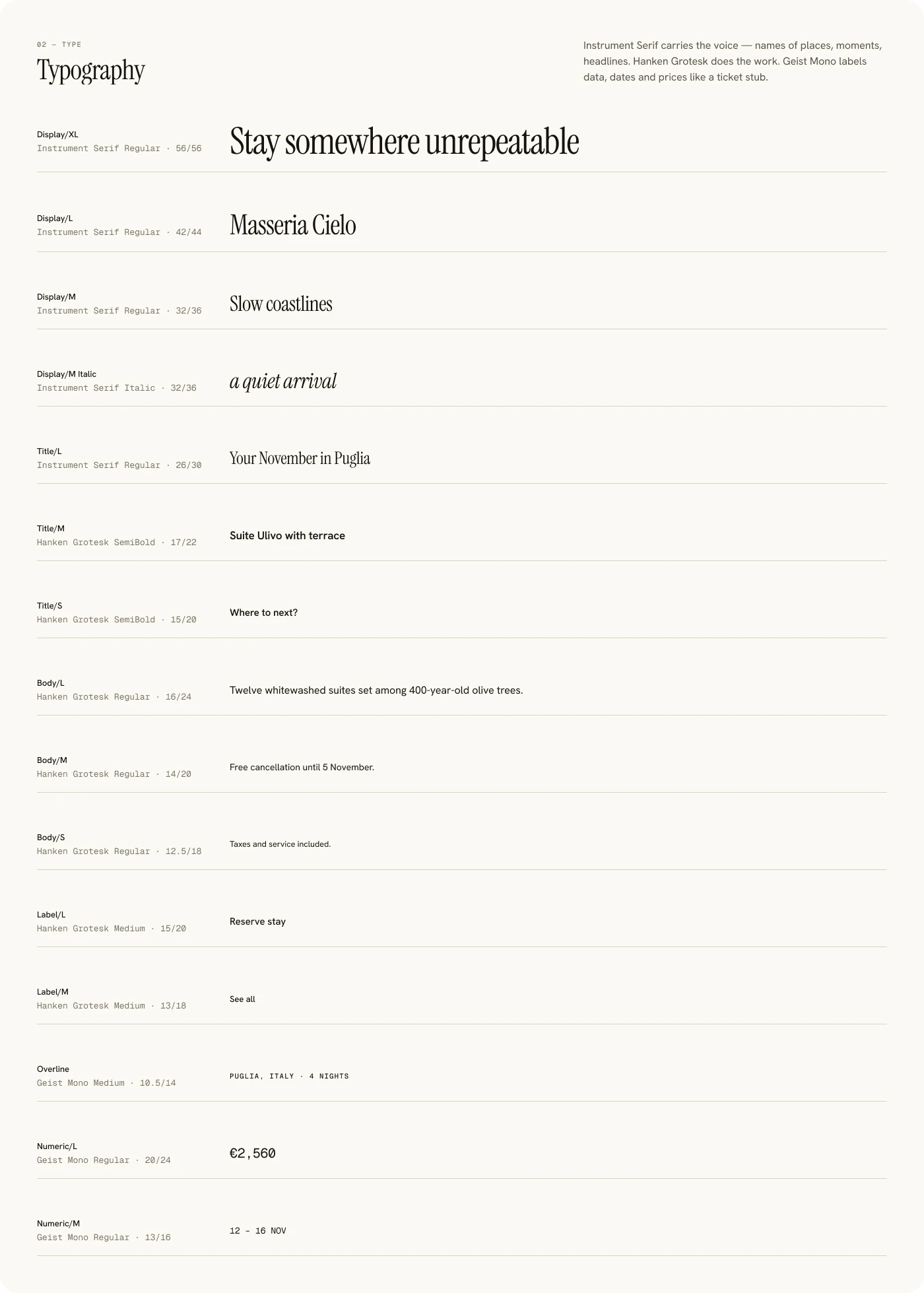
A palette borrowed from linen, letterpress and Mediterranean groves. Colour is used sparingly; hierarchy comes from type and space. Instrument Serif carries the voice, Hanken Grotesk does the work, and Geist Mono labels dates and prices like a ticket stub.
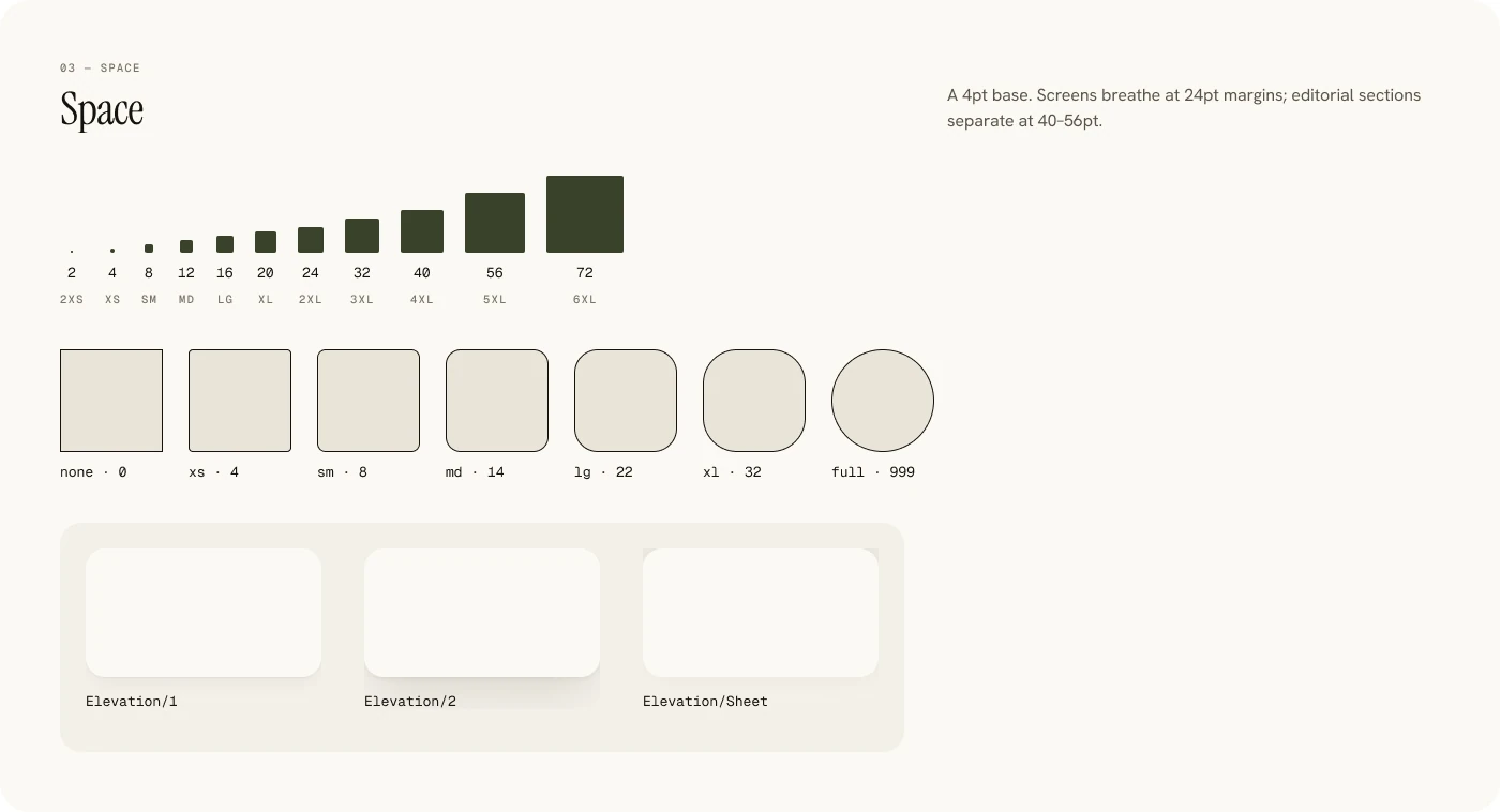
Three variable collections: Primitives, Color with Light and Dark modes, and Spacing. Every colour variable carries web code syntax, like var(--color-bg-canvas), which is what this page’s CSS uses. Switch Light and Dark at the top to see it.
bg/canvas#F4F0E8#16130Fbg/surface#FBF9F4#24211Dbg/accent#3A422B#A7AE8Atext/primary#16130F#F4F0E8text/secondary#5A5348#A39A8Atext/warm#A65A3A#D49A7Ctext/brass#B08A4A#D6BE8CContrast, key text pairs
| Pair | Light | Dark |
|---|---|---|
| text/primary on bg/canvas | 16.3 | 16.3 |
| text/secondary on bg/canvas | 6.7 | 6.7 |
| text/accent on bg/canvas | 9.3 | 8.0 |
| text/on-accent on bg/accent | 10.0 | 8.0 |
Ratios computed from the resolved token values (WCAG 2.1).
Masseria Cielo
Instrument Serif · the voiceWhere to next?
Hanken Grotesk · the work12 NOV · €2,488
Geist Mono · the data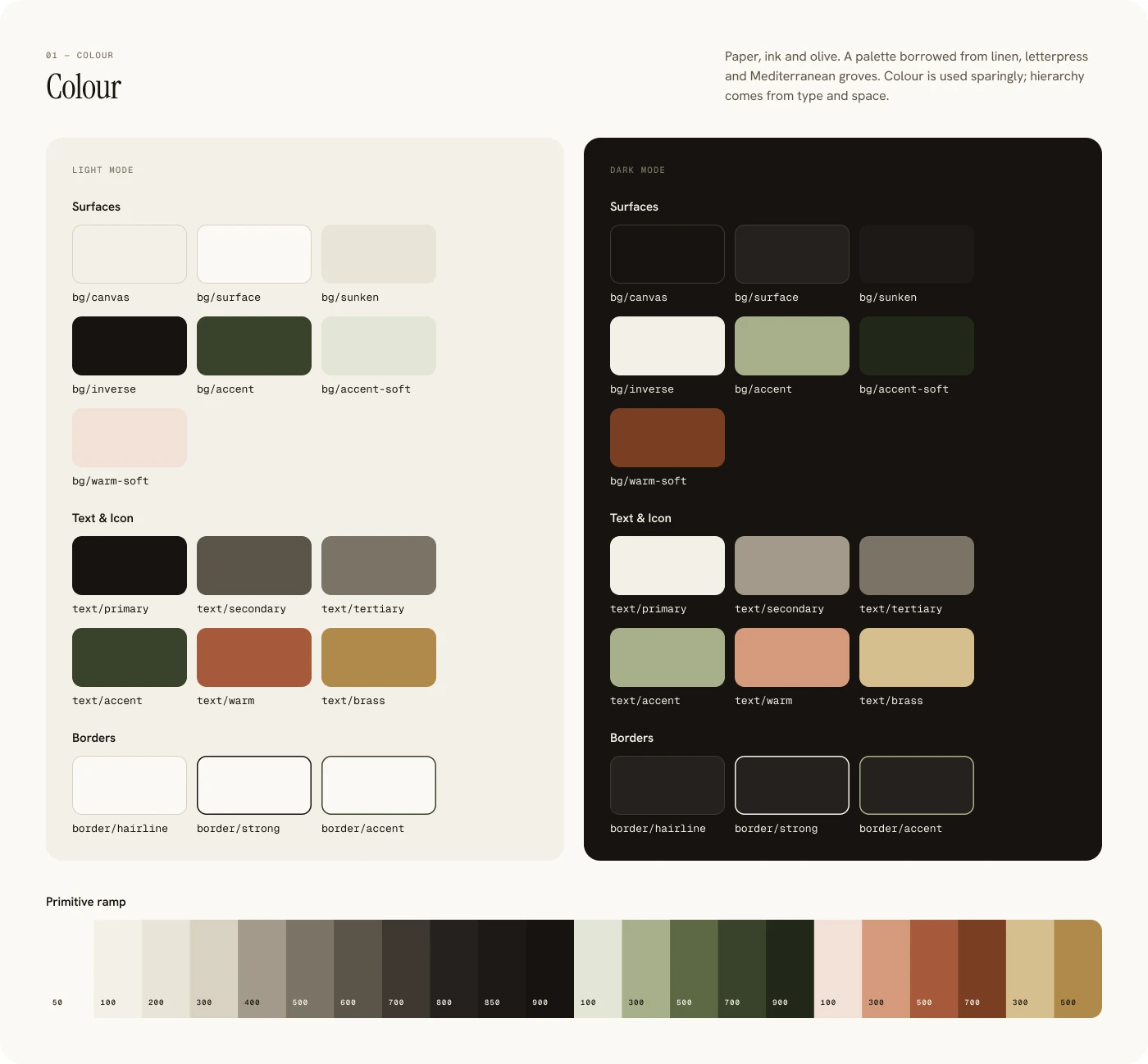
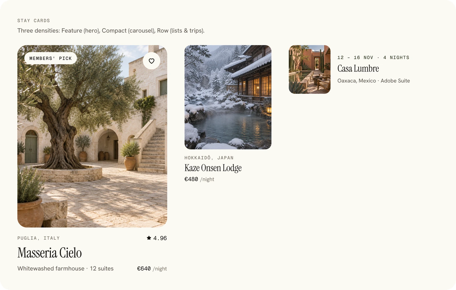
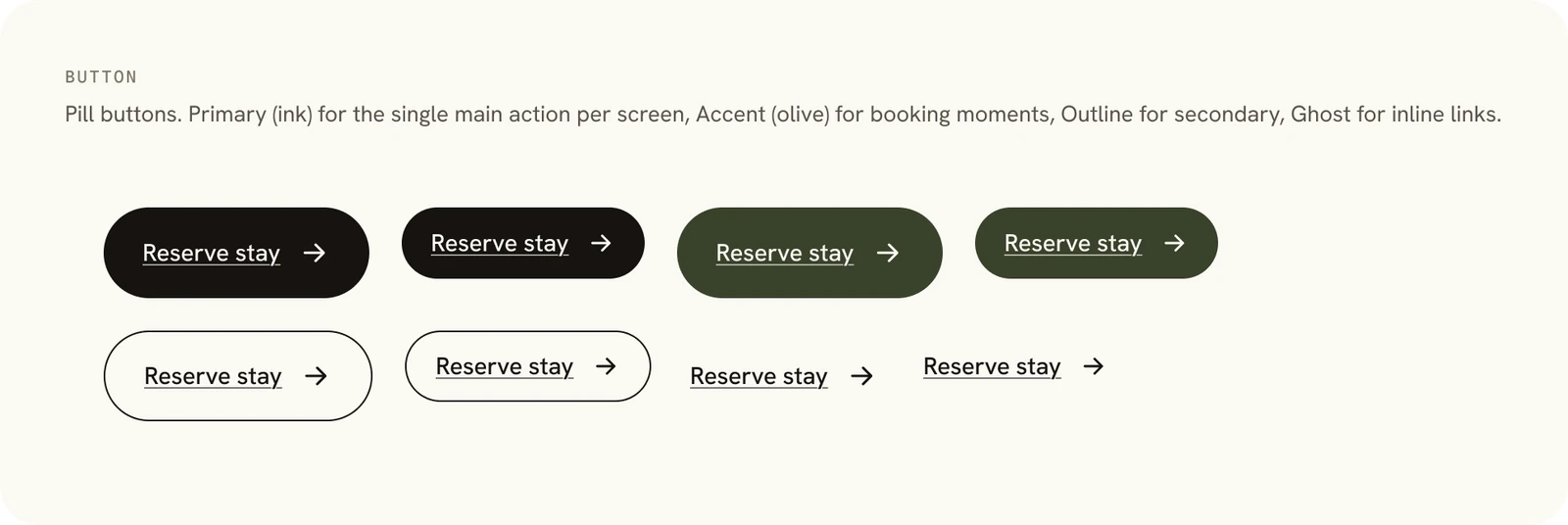
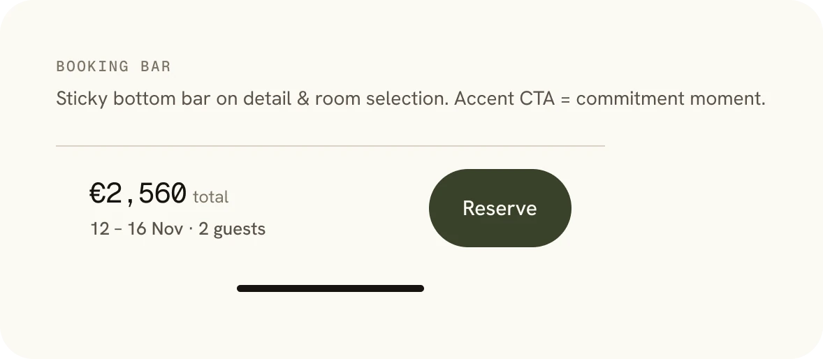
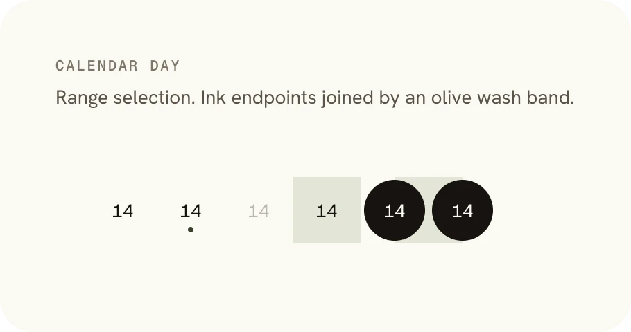

04 · The screens
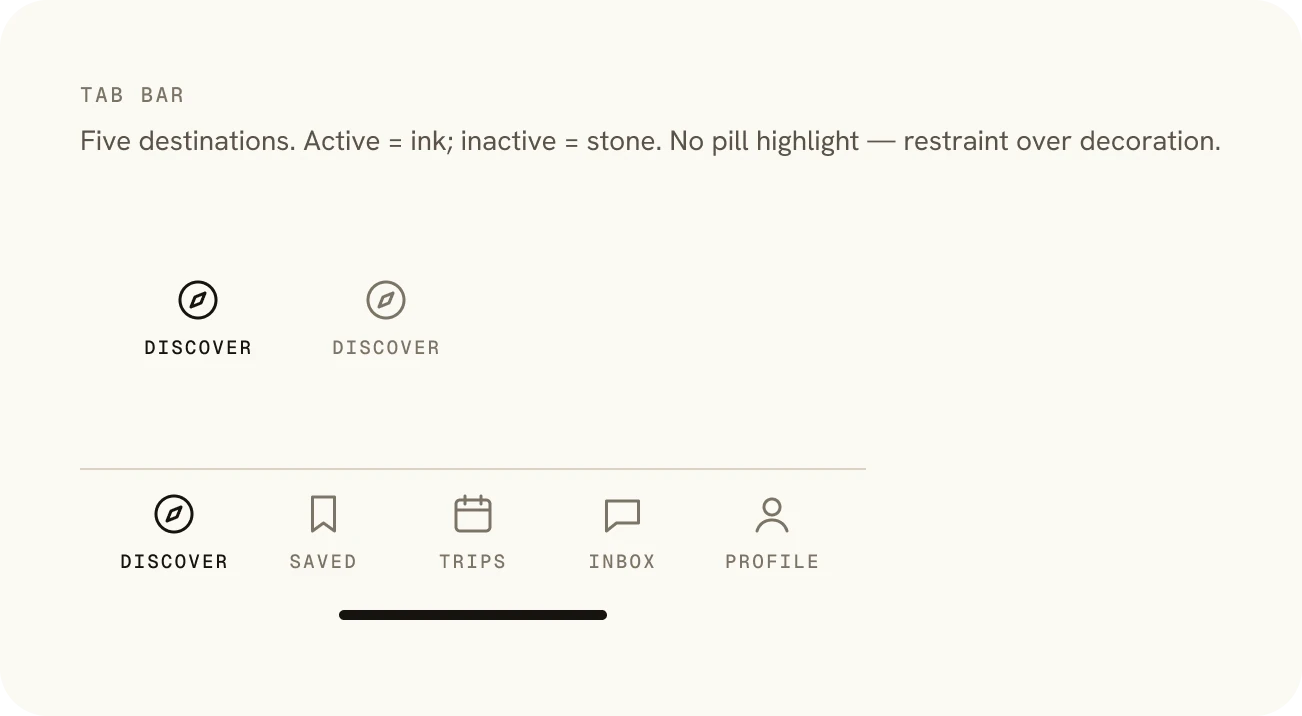
Every screen at 393 × 852. Scroll sideways to see them all. Screen 14 is Discover in dark mode, built from the same tokens.
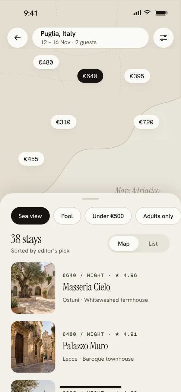
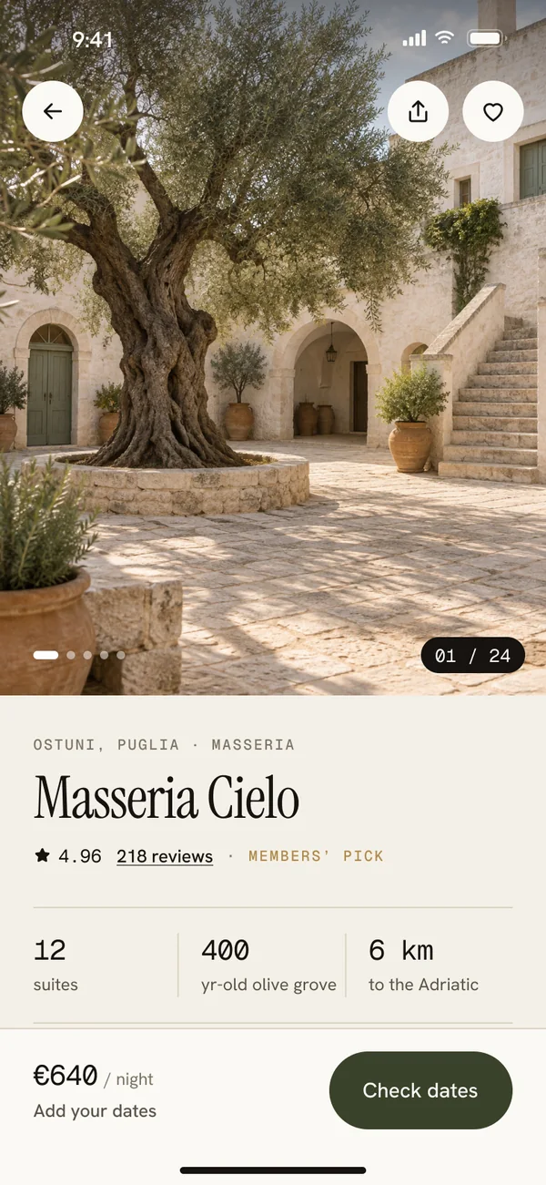
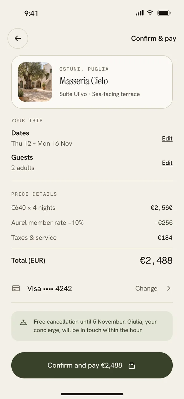
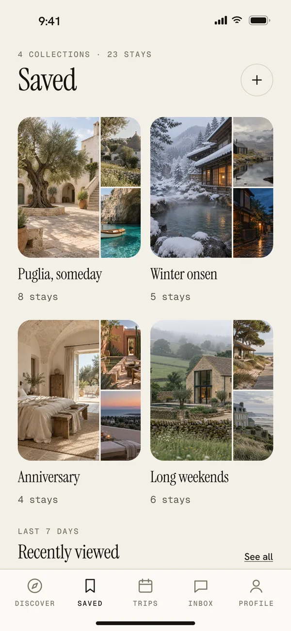
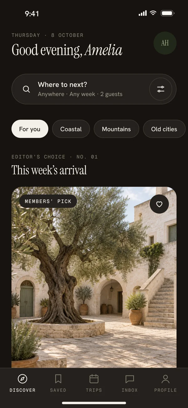
Discover and the stay detail page at their full height, as a guest would scroll them.


05 · Try it
104 interactions in four flows: onboarding, browse and book, trips and account, and dark mode. It runs inside Figma, right here on the page.
Loads Figma’s player (about 5 MB).
06 · Design principles
Thanks for reading.
See all projects